Wednesday, June 22, 2016

Technique Tutorial-Keeping Stenciled Letters Straight

Using lettering stencils is a great way add words to your project as I did on my fabric page for the SOCC Week Three Challenge. But, you may well ask, how can I keep my lettering straight without marking my fabric? Well it really is a simple process and I will share it with you now.


 I used a lettering stencil, the Dylusions Paint Pen in Black Marble and a needle threaded with black thread.


 Lay a ruler where you want your lettering to be. Take your needle and thread and take a small stitch at the end of your word/sentence. Leave about a 5cm (2 inch) tail hanging at the side. Take another small stitch about 4cm (1 1/2 inches) along the ruler. The measurements are not important, I just wanted to give you an idea. Adjust to suit your project. Continue until you have a line long enough for your word/sentence and leave the needle and thread hanging at the side.
Stencil your word/s being sure to clean your stencil after each letter so you don't transfer unwanted black paint to your project.


After you have finished stenciling, simply pull the needle and thread out of the fabric and you are left with perfectly straight lettering and no unsightly guide lines. Too easy!

Tuesday, June 21, 2016

Technique Tutorial-Distress Ink and Perfect Pearls Foil Fleck Background

PLEASE NOTE: Distress Ink and Perfect Pearls are not permanent on fabric and are only suitable for art projects that will not be laundered.

I loved experimenting with Perfect Pearls on my last fabric page for the SOCC Week Three Challenge. Inspired by Tim's "Perfect Splatter Distress" technique, I discovered a way to make the Pearls look like foil flecks on my fabric background.

I started by creating a layered background with Distress ink using Tim's "Wrinkle Free Distress" technique. If you are unfamiliar with this technique you can learn all about it and many other techniques by taking Tim's Creative Chemistry 101 and 102 online classes. You can find more information over at Online Card Classes.


I began with my lightest colour first, in this case Stormy Sky. Don't forget to iron the background (wool setting and no steam) from the right side between each colour addition.


Next I added Faded Jeans.


Finally I added Chipped Sapphire. I later also inked around the edges with Chipped Sapphire.
Next the fun begins with the Perfect Pearls.


I pounced Sunflower Sparkle all around the border of the heart. Check out my Technique Tutorial-Perfect Pearls on Fabric to see how I achieved this.
To create flecks, simply pinch some Pearls between your thumb and fore finger and sprinkle it over the Distress Ink background. Be sure to vary the blobs of Pearls but don't make then too big. I used both Forever Red and Sunflower Sparkle Perfect Pearls.


 This picture gives you an idea of the size of the sprinkled blobs.
Next, using a Mini Mister, spritz lightly but thoroughly all over the Perfect Pearls with water. Make sure the Pearls are wet but not flooded.
To make them look like foil flecks, take an iron on a wool setting, no steam and iron on the right side with an up and down motion over the Pearl blobs. The Pearls seem to melt into the background and become shiny. Flip the fabric over and iron on the wrong side as well. Any excess Pearls will come away and you will be left with little shiny foil like flecks.


This is how it looks after you iron your background fabric. Magical!

I hope you enjoyed this tutorial and will try it out for yourself.

Monday, June 20, 2016

Technique Tutorial-Perfect Pearls on Fabric.

PLEASE NOTE: Perfect Pearls are not permanent on fabric and are only suitable for art projects that will not be laundered.

I used Perfect Pearls on fabric for the first time on my fabric page for the SOCC Week Three Challenge. They are so simple to work with and blend beautifully. They give a gorgeous sparkle to fabric and adhere really well. Just follow these simple steps and you will have a lovely piece of glitzy fabric in no time.

I started with dry cotton fabric backed with some light weight iron on interfacing.

I am using Forever Red Perfect Pearls for my heart. Dip the soft brush that comes with the Pearls into the pot and add a generous amount to the fabric with a gentle pouncing action. Avoid sweeping the brush from side to side as you will dust the powder off the fabric surface. You will want to be generous with the Pearls but be sure to work it into the fabric weave not leaving loose piles of powder on the surface. 


To add some depth and shading I am using Blue Smoke Perfect Pearls around all the edges of the heart including the broken edge. Repeat the same process as for the heart centre but this time keep the brush only half on the edge of the heart. Some of the pearls will land on your work surface, just scoop it up with your brush and continue around the edge. As you can see, Perfect Pearls blend beautifully together.
The next step is to fill a Mini Mister with water and lightly but thoroughly spritz with water all over the Pearls. It is very important to use a Mini Mister as you need a really fine all over misted spray for this technique to work. Avoid flooding the Pearls. You will see the Pearls glisten as they come into contact with the water.


This photo of my backing fabric picks up the glisten a little. It is hard to photograph!
Now it is important to leave it to air dry. This will take some time depending on your climate. You can tell if it is dry simply by feeling it. When you touch the surface, if there are still loose particles of Pearls, you will need to spritz with more water and allow to dry.


You can leave the Pearls as they are, but I decided to over stamp the dry Pearls with the "Curly Background" stamp by Kaszazz and Fired Brick Distress Ink. I like the embossed look it gave to my heart.


I tried to capture the lovely sparkle of the Pearls but the photos really just don't do it justice.

So there you have it! A really simple technique but with stunning results.


Saturday, June 18, 2016

SOCC Week 3 Challenge: Distress Inks and Perfect Pearls.

Do not let the issues of life harden your heart.

This is the third week of Summer of Creative Chemistry 2016 and I found this challenge to be very challenging indeed. I have never used Perfect Pearls on fabric before so this was very new for me. I have been delighted with the results and I now have a new medium to use in my fabric art. I am so grateful to Tim for setting these challenges and Online Card Classes for hosting them. They have pushed me out of my familiar zone and helped me to discover new techniques which I am very excited to be able share with you here on my blog.


I created my background by layering Stormy Sky, Faded Jeans and Chipped Sapphire Distress Inks. I was able to achieve what looks like foil flecks over the background using Forever Red and Sunflower Sparkle Perfect Pearls. Sunflower Sparkle surrounds my heart and Forever Red was used on my backing, bordering my page.
I will be doing a tutorial on my background.


I created my heart using Forever Red Perfect Pearls in the background. I used Blue Smoke Perfect Pearls for shading. I over stamped my heart with "Curly Background" by Kaszazz and Fired Brick Distress Ink. I think it created a neat embossed look to my heart. The crack is backed with Chipped Sapphire Distress Ink and stitched with gold embroidery thread. I have padded my heart to give it a soft look.
I will also be doing a tutorial on using Perfect Pearls on fabric.


I used a lettering stencil and the awesome Dylusions Paint Pen in Black Marble for my words. I love the fine tip on the Dylusions Paint Pens and they work really well with fabric. I am super pleased with them and use them often. To finish I couched the gold embroidery thread to my background.
I will show you how to keep your words straight when using stencils in another post.

I really enjoyed creating this page using Perfect Pearls because it was such a challenge. I'll be back soon with some technique tutorials.

Friday, June 17, 2016

Technique Tutorial- Distress Stain Background

PLEASE NOTE: Distress Inks are not permanent on fabric and are only suitable for art projects that will not be laundered.

I so enjoyed creating my last project for the SOCC Week Two Challenge that I thought I would put together a quick tutorial on how I created the background for my fabric page.


The first step was to lightly spray my fabric with water. I then applied Tea Dye Stain all over and Brushed Corduroy Stain in random places. I found the Stains to be much more stable on fabric than the Distress Inks. However I still ironed my fabric (from the right side) just to stop my colours moving.


Next I "spritzed and flicked" my stained background with water and ironed.


Then I spread out some Walnut Stain on my craft sheet (apologies for my stained craft sheet, it is well used), making sure I had different sized droplets.


I then went ahead and randomly "stamped" small sections my background into the Walnut Stain and ironed it.


I used the brick stamp from the "Bitty Grunge" by Stampers Anonomous and the "Crackle" stamp from Kaisercraft with Espresso Archival Ink. I again ironed it from the right side.


I applied some Picket Fence Stain to my craft sheet and used my finger to apply the stain in random places on my background just to add some highlights. I again ironed it.


I stamped some background foliage using "Nature's Elements" clear stamps by Stampers Anonymous and Fern Archival Ink.


Finally I smudged some Vintage Photo Distress Crayon around the stone door trim for shading.

I hope this tutorial will help you to create your own backgrounds with Distress Stains.

Tuesday, June 14, 2016

SOCC Week 2 Challenge: Distress Stains and Stamps

The past only has as much power as you invest into it.


This week the challenge was to use Distress Stains and stamps in a project. This will be the second page of my Technique Fabric Book.
I am really enjoying these challenges, revising techniques and making new discoveries along the way. I haven't used my Stains for a while so it was good to get them out and play.


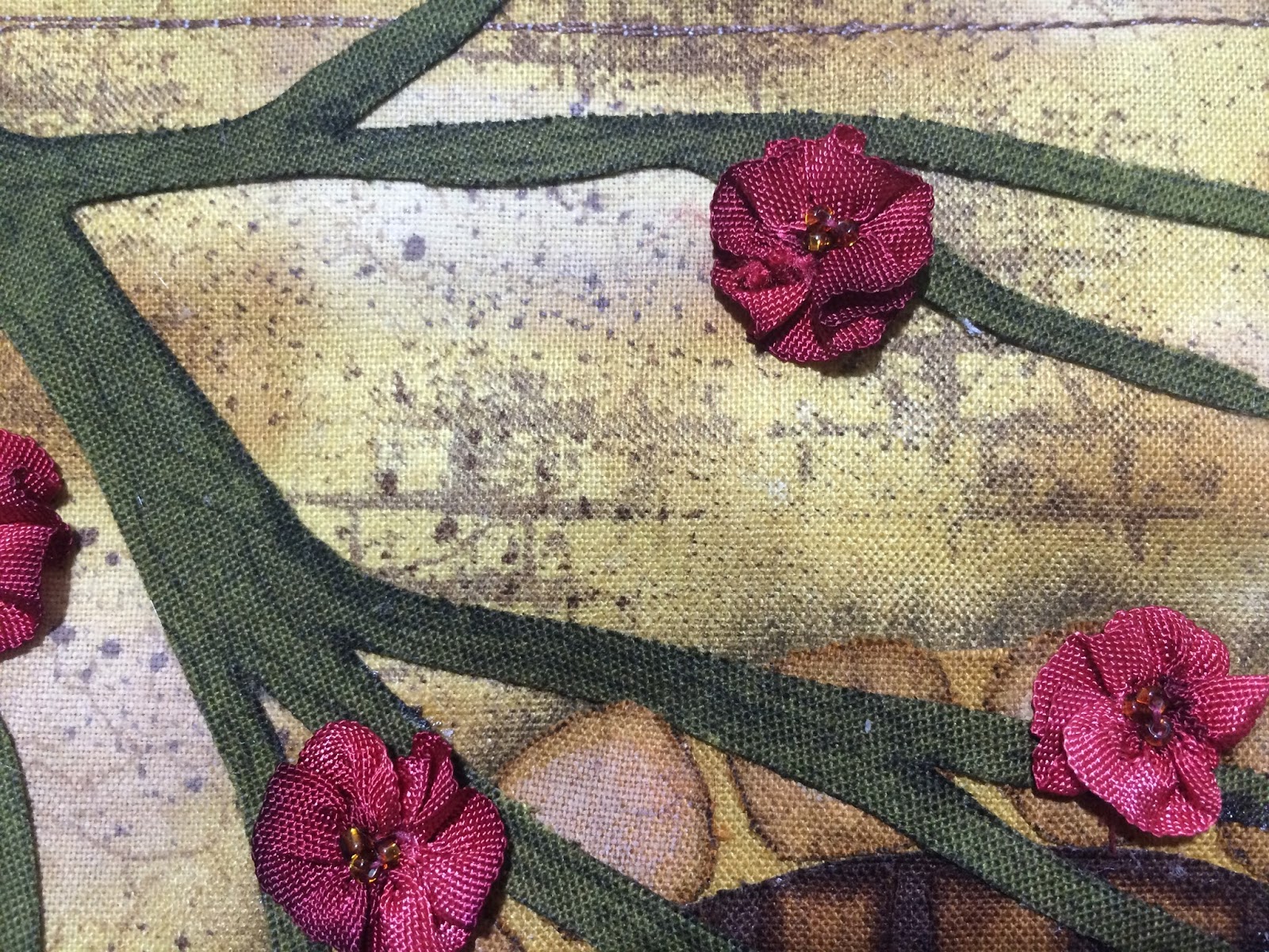
I have used Tea Dye, Brushed Corduroy, Walnut Stain and Picket Fence Stains for my wall background. I also used Forest Moss Stain and Marker for my vine and coloured some seam binding with Aged Mahogany for blossoms. I used the brick stamp from "Bitty Grunge" by Stampers Anonymous and "Crackle" texture stamp by Kaisercraft.


I used Aged Mahogany and Tea Dye Stains and Markers for my mushrooms. I added some Picket Fence Stain as a highlight. I stamped some background foliage using "Nature's Elements" clear stamps by Stampers Anonymous and Fern Archival Ink. The rocks were coloured with Brushed Corduroy Stain. I added some texture to them with the "Crackle" stamp and Espresso Archival Ink and highlighted them with Picket Fence Stain. I used Tea Dye Stain for the mortar.


I used Walnut Stain and Brushed Corduroy Stains for my door. I stamped the wood palings texture with the "Wood Grain" texture stamp by Kaisercraft and Ground Espresso Archival Ink. The sign is coloured with Tea Dye Stain and Marker.
I will be doing a Technique Tutorial for the background wall of this project so stayed tuned for that.

Monday, June 13, 2016

Technique Tutorial-Colouring Fabric With Distress Ink


PLEASE NOTE: Distress Inks are not permanent on fabric and are only suitable for art projects that will not be laundered.

In my previous post I talked about the instability of Distress Ink on seam binding. The same can be said when working with fabric.

In my first sample I used Stormy Sky Distress Ink through a stencil, spritzed it with water and let it dry naturally.


You can see how the colour separated into grey and blue. I found it interesting that the grey stayed put while the blue travelled. I liked this interesting shadow effect.

In my second sample I again used Stormy Sky Distress Ink through a stencil and spritzed it with water, however this time I dried it straight away.


The way I dried it was with an iron on a cotton setting and no steam. Place your inked, damp fabric right side up on a scrap of fabric to protect your ironing board. Press it on the right side. If you press it on the wrong side, some of the colour will transfer to your scrap fabric leaving you with a washed out image.

By comparison,


depending on the effect you want, leave it to dry naturally for a multi coloured shadow effect, or dry it immediately with an iron for a sharper, brighter colour.

These techniques are beneficial when creating backgrounds on fabrics with Distress Inks which we will explore in a later post.